Chillion
Client
Lito Investment
Work
Brand naming & development
Brand identity
Sales Deck development
Sales & marketing materials design
Website development
Lito Investment bắt đầu cung cấp dịch vụ quản lý, kiểm soát sổ sách, kế toán từ xa cho các doanh nghiệp ở Mỹ và Úc vào giai đoạn đầu của đại dịch Covid-19.
Nhận thấy nhu cầu và xu hướng sử dụng dịch vụ trợ lý ảo ngày một tăng nhanh khắp thị trường toàn cầu, Lito biết mình cần đầu tư cho một thương hiệu bài bản và chiến lược hoạt động lâu dài hơn. Và Lito đề nghị hợp tác cùng Jodric.
During the lock-down time in Vietnam, Lito Investment started a new line of service—assisting businesses in the US and Australia to manage their books and financial documents.
Witness the rising demand and potential of the virtual assistant industry, they seized the chance to invest in a more professional and sustainable brand strategy. And they approached Jodric.


Để tránh sa vào việc tiếp cận và giải quyết các vấn đề của doanh nghiệp một cách rời rạc, Jodric cùng đội ngũ Lito trải qua rất nhiều buổi thảo luận để từng bước làm rõ các khía cạnh liên đới của doanh nghiệp. Kết quả của các buổi này là một bức tranh hoàn chỉnh về cơ hội cạnh tranh của thương hiệu và một tuyên ngôn xúc tích để làm kim chỉ nan cho hành động cho mọi thành viên.
To avoid ourselves from falling to the "pilot mode" when approaching a new problem, we sat with Lito team through a lot of discussions, full of uncertainties and challenging talks, to refine our understanding of the market and Lito's opportunities to answer the demands. After these sessions, we drilled down to a succinct "brand promise", which will guide every decision of the team.


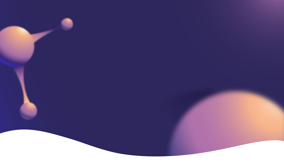
Hiện tượng tế bào đang phân tách mang hàm ý mong muốn và hình ảnh phù hợp để Jodric xây dựng một concept truyền tải các giá trị, cũng là quan điểm làm việc của Chillion – luôn nỗ lực để kết nối, thấu hiểu và phối hợp nhịp nhàng như một "tế bào" tách ra từ bộ máy của khách hàng. Tông màu tím chủ đạo mang lại cảm giác "chill", thư giãn, đúng với ý nghĩa tên thương hiệu.
The image of a splitting atom help us to build a concept that clearly communicates Chillion's top-tier values, and working etiquette—strives to connect, understand and work closely, rhythmically with the clients, as a part "splitting" from their system. The main color, purple, brings the feeling of "chill", relaxation, reinforcing the meaning of the name.